So far we have presented a function using a function rule, but it is often useful to show a function visually. We do this with graphs.
The graph of a quadratic function is a parabola.
The picture on the right is the graph of the function \[f(x)=\blue ax^2+\green bx+\purple c\]
By varying the sliders, the values of #\blue a#, #\green b#, and #\purple c# can be changed.
When the function changes, the graph changes accordingly. The graph shows visually how the function looks like.
Now, we will discuss a formal definition of a graph.
The graph of a function #f : \blue X \to \orange Y# is the set
\[\{\rv{\blue x,\orange{f(x)}} \mid \blue x \in \blue X\}\]
This is a subset of #\blue X \times \orange Y#.
For a real function #f\colon\blue X \to \orange{\mathbb{R}}# with #\blue X \subseteq \mathbb{R}#, the graph of a function is a subset of the plane #\mathbb{R}^2#.
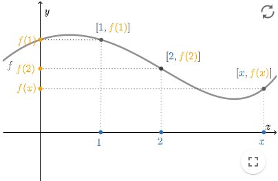
As we already saw in the graph above, we often draw a graph of a real function on the #xy#-plane. The graph is the collection of points #\rv{x,y}# on the plane with #y=f(x)#.
For a real function #f#, we can read the value of #f(x)# from the graph by reading the height of the graph above the point #x#, as indicated above.
A graph can also help to determine the domain and range of a function.
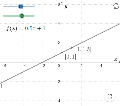
A linear function has the form #f(x)=\blue a x+\green b# with the numbers #\blue a# and #\green b#. The graph of this function is a straight line.
The slope of this line is determined by the direction of the coefficient #\blue a#.
In addition, this line passes through the point #\rv{0,\green b}#.
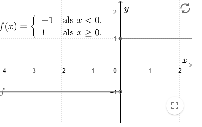
In the graph of a piecewise-defined function, we often have a jump in the graph (see figure to the right).
We then use an open circle to indicate that the item itself is not part of the graph, but all points of the line near that point are.
We use a closed circle to indicate that the point itself is also part of the graph.
In the field of statistics, there's the term histogram. A histogram is a diagram of the frequency distribution of data grouped into classes. The age of a group of #100# students, for example, can be displayed in a histogram as in the figure to the right.
A histogram can also be seen as the graph of a function. In the example above regarding number of students per age bracket in a group of #100# students, the function shows how many students (element from #\orange Y=\orange{\mathbb{R}}#) there are in each age bracket (element from #\blue X#). The histogram is the corresponding graph.
Below you'll find the graph for a function #f#.
Please give the value of #f(-1)#.
#f(-1)=# #0#
We can read this from the graph by searching for the value #-1# on the horizontal axis .
From there we draw a vertical line towards the graph.
From the point of intersection of the vertical line with the graph we draw a horizontal line towards the #y#-axis.
We then read which value of #y# corresponds to which the value of #x# on the #y#-axis.
We find that at #x=-1#, the value of #y# equals #y=0#.
 Functions and graphs


